Sasa's Personal Blog
👩💻 Author Introduction
Author: Sasa
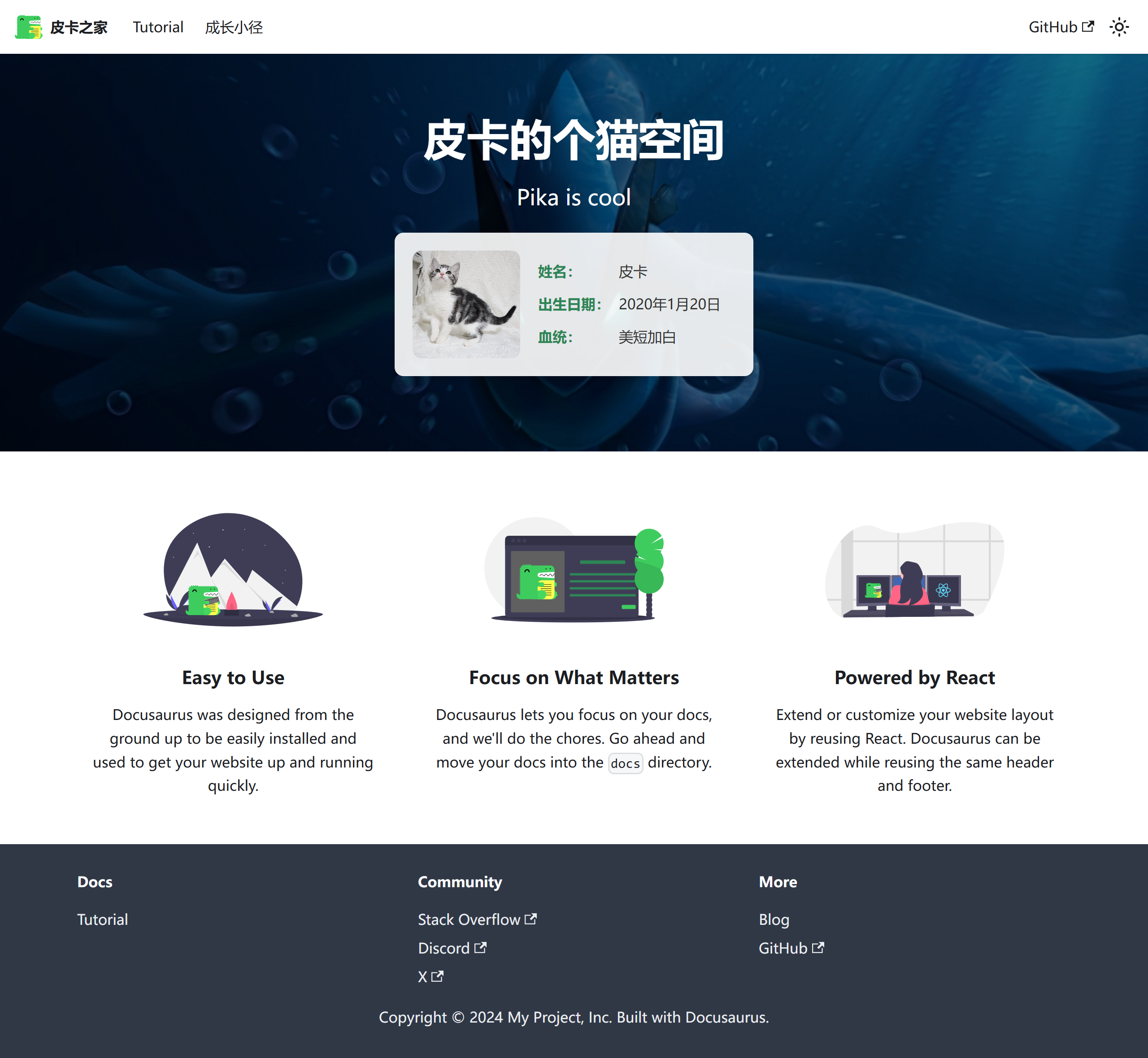
Website: Pika's Home
Project Type: Personal Blog Website
Tech Stack: Docusaurus v2, React, CSS3
🎨 Project Showcase
Homepage Display

Homepage Design: Features a fresh color scheme and clean layout design, highlighting personal brand characteristics
Growth Path Page

Growth Path: Showcases personal growth journey and learning trajectory with well-organized content
Design Highlights Analysis
Visual Hierarchy
User Experience Flow
✨ Key Features
🎯 Core Characteristics
- Fresh Design: Adopts a minimalist and elegant visual style with focus on user experience
- Responsive Layout: Perfectly adapts to mobile, tablet, and desktop devices
- Personalized Content: Showcases personal growth journey and experience sharing
- Smooth Animations: Carefully designed interactive effects enhance user experience
🌟 Innovation Highlights
-
Personalized Navigation Design
- Unique navigation bar style
- Smooth page transition effects
- Mobile-friendly interactive experience
-
Content Presentation
- Card-based information display
- Progressive content loading
- Clear information hierarchy
-
Visual Effects Optimization
- Carefully selected color schemes
- Appropriate whitespace design
- Unified design language
🛠️ Technical Implementation
Core Tech Stack
Performance Optimization Measures
Image Optimization
const config = {
  plugins: [
    [
      '@docusaurus/plugin-ideal-image',
      {
        quality: 70,
        max: 1030,
        min: 640,
        steps: 2,
        disableInDev: false,
      },
    ],
  ],

  themeConfig: {
    image: '/screenshot/screencapture-pika-s-home-vercel-app-2024-11-24-23_08_34.png',
  },
};
Code Splitting
import { lazy, Suspense } from 'react';
import useBaseUrl from '@docusaurus/useBaseUrl';

const LazyImage = lazy(() => import('./OptimizedImage'));

export default function ImageWithFallback({ src, alt, ...props }) {
  return (
    <Suspense fallback={<div className="image-loading">Loading...</div>}>
      <LazyImage
        src={useBaseUrl(src)}
        alt={alt}
        loading="lazy"
        {...props}
      />
    </Suspense>
  );
}
Caching Strategy
{
  "headers": [
    {
      "source": "/screenshot/(.*)",
      "headers": [
        {
          "key": "Cache-Control",
          "value": "public, max-age=31536000, immutable"
        }
      ]
    }
  ]
}
Architecture Design
🎯 Learning Value
Design Thinking
This project demonstrates how to:
-
Build Personal Brand Identity
- Consistent visual style
- Personalized content presentation
- Professional technical implementation
-
Optimize User Experience
- Clear information architecture
- Smooth interaction design
- Responsive layout adaptation
-
Technical Implementation Details
- Modern frontend tech stack
- Performance optimization strategies
- Deployment and maintenance solutions
Key Learning Points
Sasa's work embodies the design philosophy of "simple yet sophisticated," worthy of beginners learning:
- Layout Planning Skills: Rational grid system and space allocation
- Color Matching Methods: Warm yet professional color schemes
- Interaction Design Concepts: User-friendly operation experience
- Content Organization Strategy: Clear information hierarchy and navigation structure
Practice Recommendations
-
Start with Imitation
- Analyze design elements of excellent works
- Understand the thought process behind the design
- Gradually develop your own design style
-
Focus on User Experience
- Always think from the user's perspective
- Simplify operational processes
- Provide clear visual feedback
-
Continuous Improvement
- Collect user feedback
- Regularly update content
- Optimize performance
🚀 Project Characteristics
Content Architecture
Design System
Color Specifications
:root {
  /* Primary Colors */
  --primary-color: #ff6b6b;
  --primary-light: #ff8e8e;
  --primary-dark: #ff4757;

  /* Secondary Colors */
  --secondary-color: #4ecdc4;
  --secondary-light: #6bccc4;
  --secondary-dark: #26a69a;

  /* Neutral Colors */
  --gray-100: #f8f9fa;
  --gray-200: #e9ecef;
  --gray-300: #dee2e6;
  --gray-400: #ced4da;
  --gray-500: #adb5bd;

  /* Semantic Colors */
  --success-color: #2ed573;
  --warning-color: #ffa726;
  --error-color: #ff6b6b;
  --info-color: #54a0ff;
}
Typography System
/* Font Families */
--font-primary: 'Inter', -apple-system, BlinkMacSystemFont, sans-serif;
--font-mono: 'Fira Code', 'SF Mono', Monaco, monospace;

/* Font Sizes */
--text-xs: 0.75rem;    /* 12px */
--text-sm: 0.875rem;   /* 14px */
--text-base: 1rem;     /* 16px */
--text-lg: 1.125rem;   /* 18px */
--text-xl: 1.25rem;    /* 20px */
--text-2xl: 1.5rem;    /* 24px */
--text-3xl: 1.875rem;  /* 30px */
--text-4xl: 2.25rem;   /* 36px */
Responsive Design
/* Breakpoint Definitions */
@media (min-width: 640px) {
  .container {
    max-width: 640px;
  }
}

@media (min-width: 768px) {
  .container {
    max-width: 768px;
  }
}

@media (min-width: 1024px) {
  .container {
    max-width: 1024px;
  }
}

@media (min-width: 1280px) {
  .container {
    max-width: 1280px;
  }
}
📊 Performance Metrics
Performance Indicators
Optimization Recommendations
-
Image Compression
- Use modern image formats (WebP, AVIF)
- Implement lazy loading strategy
- Provide different resolution versions
-
Code Optimization
- Remove unused CSS
- JavaScript code splitting
- Enable Gzip compression
-
Caching Strategy
- Set appropriate cache headers
- Leverage CDN acceleration
- Implement server-side caching
This project is an excellent example for learning personal website development, demonstrating how to perfectly combine technical implementation with design aesthetics to provide users with an excellent browsing experience.